The given graph shows the nitrogen oxide emissions produced by four vehicles. Summarize the information by selecting and reporting the main features and make comparisons where relevant.
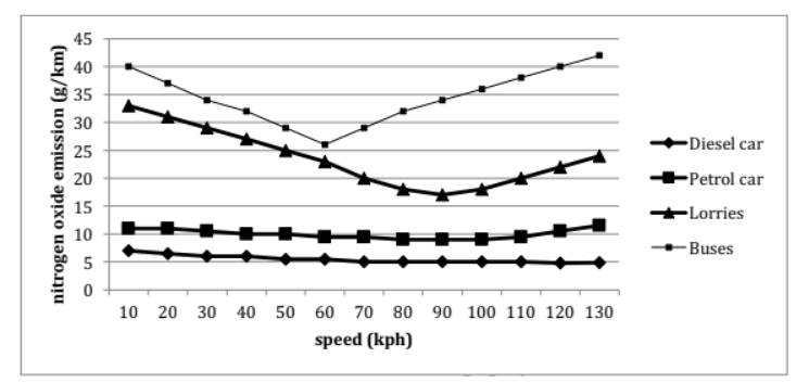
The line chart compares the amount of nitrogen oxide emitted by different types of vehicles in relation to their velocity. Overall, the amount of emissions from trucks and buses decreases as they begin to accelerate, but increases when the vehicles are at top speed, compared to a fairly constant level from diesel and gasoline cars.
Regarding vehicles that release lower levels of emissions, petrol automobiles produce approximately 11g of nitrogen oxide per kilometer at a speed of 10kph. As the vehicle accelerates to 100kph, the amount of emissions decreases minimally by roughly 2g/km. However, at the velocity of 130kph, it rises to about 12g/km. Diesel cars emit a lower amount of roughly 7g/km at 10kph, which declines at a fairly constant rate to precisely 5g/km when the vehicle reaches 130kph.
Concerning the remaining categories, the amount of emission for buses starts at 40g/km at 10kph and plummets to just over 25g/km at 60kph. From this point, it begins to surge dramatically and reach the highest point of around 42g/km when the vehicle maintains a velocity of 130kph. At 10kph, lorries discharge approximately 34g/km, which is moderately lower than buses and the figure decreases to about 16g/km at 90kph, before soaring to nearly 25g/km at 130kph.
(215 words)