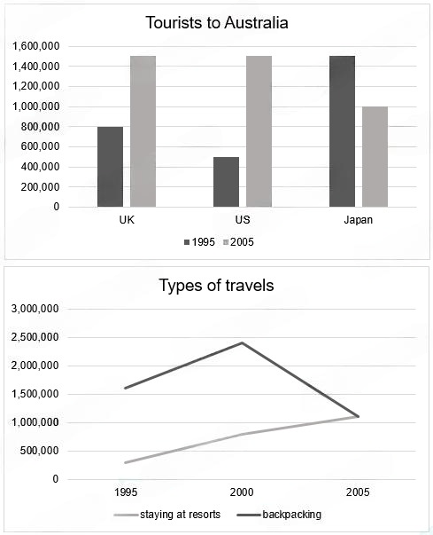
The bar chart below shows the number of tourists in three nations who travel to Australia in 2005 and 2015. The graph below shows the number of tourists who use two types for holiday.
- Body 1:
- Body 2:
The given bar graph illustrates how many tourists from the UK, the US and Japan went to Australia in 2005 and 2015, whereas the line chart shows the development of different kinds of vacation in this country in the period.
Overall, it is immediately noticeable that although Japanese tourists dominated the line charts in 2005, it claimed the bottom position in 2015, allowing those of different nationalities to take its place. Meanwhile, the figure for people staying at the resort for the holiday in Australia were significantly higher than that of people who went packaging at the start of the period, but both of them converged at the same number toward the end of the period.
Looking at the bar chart, one of the most notable observable details is that Japanese tourists in 2005 were significantly more numerous than those from the UK or US, with the latter at 800,000 and 500,000 tourists, respectively. However, by 2015, both the numbers of UK and US tourists jumped to 1,500,000, which is similar to the Japanese figure at the start of the period. By contrast, Japan decreased to exactly 1,000,000 tourists, staying at the lowest place compared to other data in 2015.
Turning to the line graph, the respective figures for people who stayed at the resort and those who went packaging in 2005 were 1,750,000 and 250,000. In the next five years, both of them increased at a relatively similar pace, to 2,500,000 and roughly 750,000. After that, while staying at the resort became less popular overtime, going packaging experienced a stable increase in interests. This trend continued until the end of the period, when the figures representing the two options were 1,250,000.
Từ vựng IELTS hữu ích: